The images of the upcoming Windows 11 Operating system from Microsoft resemble a mixture of our beloved KDE Plasma and GNOME. How much they are similar? We try to find out.
There’s a saying which I remember – ‘Good artists copy. Great artists steal‘. I don’t know the design team behind Windows 11, but it seems they are pretty good inspired by the Linux desktops. If you look at the Windows OS look over the years – from Windows XP to 7 to 10 – there is not much changed in terms of look and feel. Until now.
Windows OS have typically 5 to 7 years of life iterations with a new release. If you think about the options of customization Windows gives you, that remained the same over the years. Even the overall desktop experience in terms of Start Menu position, width, color – all remained constant.
But with the new look of Windows 11 – this is changing. Let me walk you through some of the screenshots I had a look at and how cunningly it is similar to the popular Linux desktop environments such as KDE Plasma and GNOME.
Table of Contents
Windows 11 Look Inspired by KDE Plasma and GNOME?
Start Menu and Taskbar
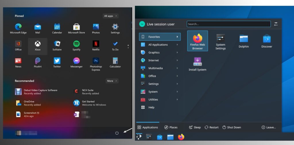
The traditional Start Menu and Taskbar theme changed in Windows 11. The Start menu and Taskbar icons are at the center of the taskbar (default view). It also gives you the option to move the taskbar icons and Start menu to the left via settings.
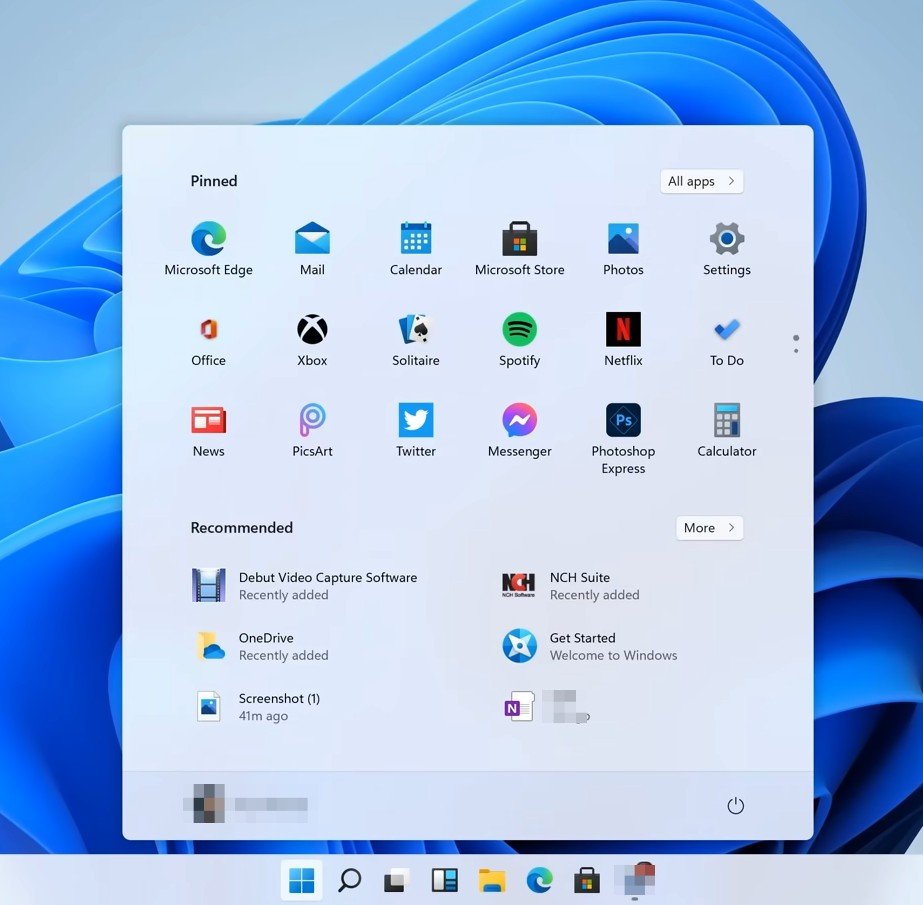
The overall approach and default color with icons remind me of the KDE Plasma taskbar and Launcher. The icons are polished and centered gives you a feel of Adwaita icons of GNOME while the taskbar looks like from KDE Plasma.
When you open the start menu, it gives you a different arrangement of the icons and options. Also, a search option at the top pops up when you start to type.
Now, look at the newly designed KDE Plasma launcher. I know, the spacing, the size of the icons, and sharpness are not the same. But you can see how they look surprisingly similar.
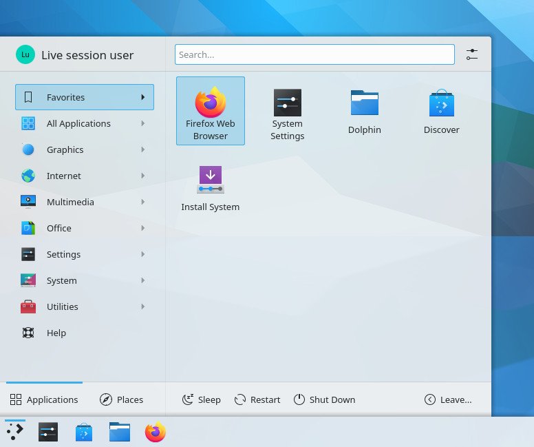
If you are using GNOME or Xfce desktop – with a little tweak of the Arc menu, you can actually have them look exactly similar.
Window Decorations
Traditionally GNOME always had rounded corners for the standard window decorations. And in compared to that Windows always had sharp corners in windows – like forever until now. Well, with Windows 11, all the window decorations have rounded corners which looks good. The rounded corners concept is not a copyrighted design or new idea. Hence the question arises, why decide to go all rounded corner now? Is there any hidden purpose?

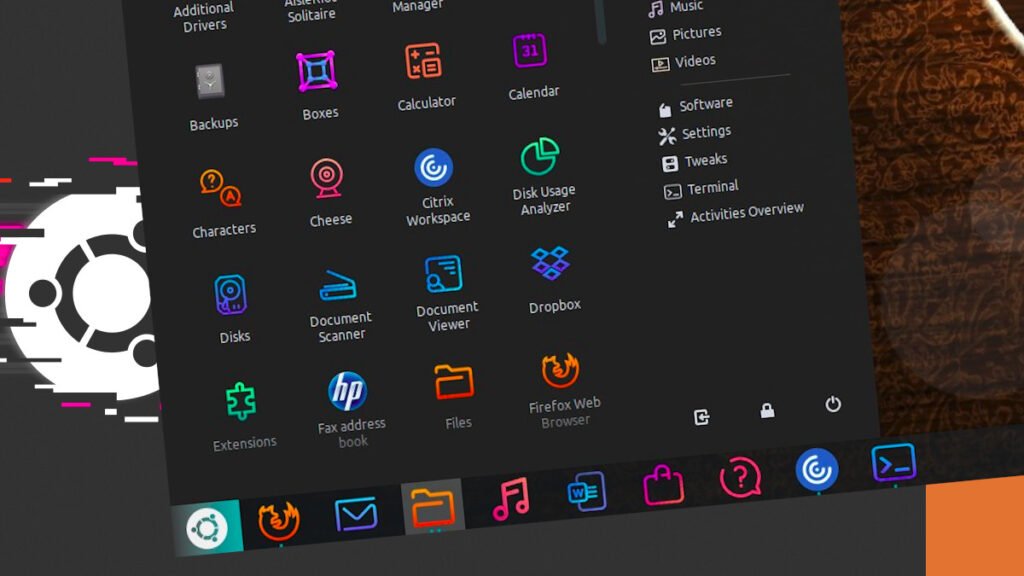
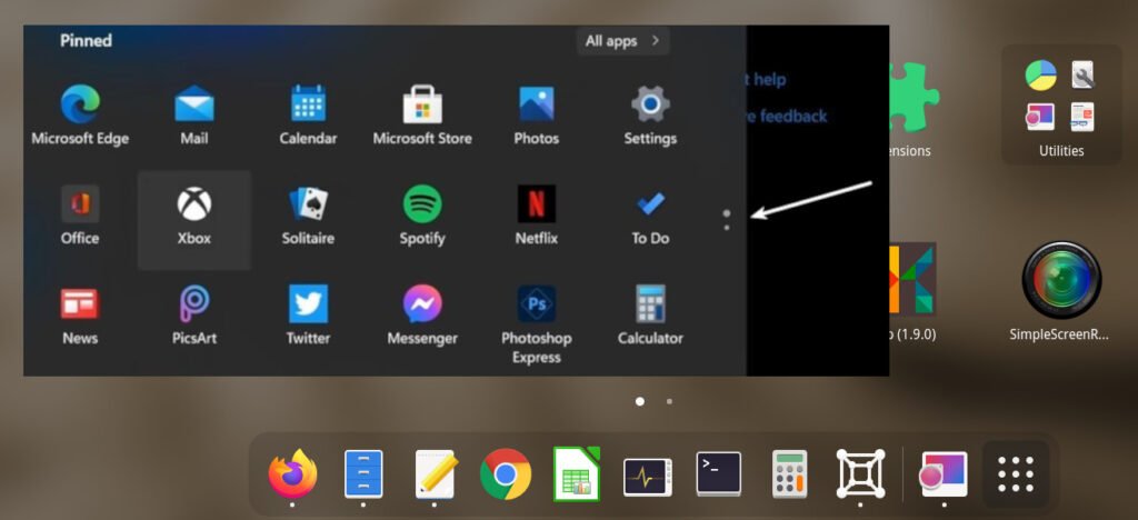
Oh, remember the application grid menu indicator in GNOME? The small dots tells you that how many pages of applications are there. It seems also to make its way to Windows 11 as well.
Color Palette
Windows always had a “blue” based theme or any blue variant over the years. Although use has options to change the accent color of the taskbar, start menu background, and window title bars. But with that option, the color palette seems drastically changed with light and dark mode combination to give a more polished and eye-candy look to the Windows desktop. Probably another avenue of inspiration of nice color palette of Ubuntu, KDE, and other flavors.
Dark Mode
Windows 11 officially support dark mode/ or dark theme for the first time. Well, I will just leave it here with the below two screenshots. The left one is a dark mode of the Windows 11 start menu and the right one is the KDE Plasma with Breeze dark theme.
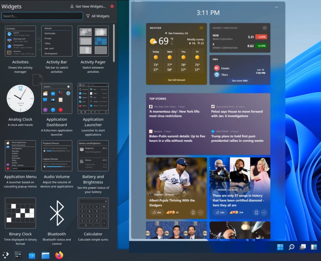
New Desktop Widgets
Inspiration never stops it seems. Remember KDE Plasma’s widgets? Well, it is not a new concept, but it lands in Windows 11. Here’s a screenshot of the new widgets drawer. You can add, remove and scroll items here.
These are just some of the items which caught my eye. Maybe there are more “inspirations” that “inspired” Windows 11 looks.
But the question is – why this is the perfect time to introduce all of these features and looks at once?
Closing Notes
Honestly, when I first looked at them, it reminds me of KDE Plasma with Breeze theme in Dark mode. And with very few tweaks, you can make it look like Windows 11. That itself says about how they are similar in looks.
If you look at the entire desktop operating system landscape – the only players are Windows, Linux Desktops, and macOS. And until now, they all had a distinct signature in their looks. For example, macOS has its own different look which stands out from everyone else. Until now, Windows also had the same – the usual Start menu with the blue theme, etc. But with these new changes, Windows gives users the most customization options and closer to the Linux Desktop looks.
In my personal opinion, the Windows team should have come up with a different signature look than just being “inspired” by our beloved Linux Desktops.
I am not sure what the future holds, but it seems the “E-E-E” is in the works with full force.
Cheers.


